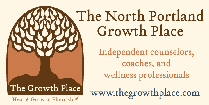
Client project: The Growth Place asked barKton Studio to create a new logo and banners to bring in the 2016 year.
Solution: barKton Studio developed a new logo for Rachel Stark, LPC the owner and practitioner at The Growth Place. Much of the inspiration for the logo came from the remodeled offices, a Craftsman style home built in Portland, Oregon. The new logo is based on drawings and patterns from the Art Noveau period (1890-1910), a period that coincided with the American Craftsman style (late 1800-1930). The colors of the logo were pulled from the house paint colors at The Growth Place. Once the logo was approved, two banners were created – one to hang up on the building and a second for remote events. There are future plans to create a metal sign for the front garden of the offices at The Growth Place.